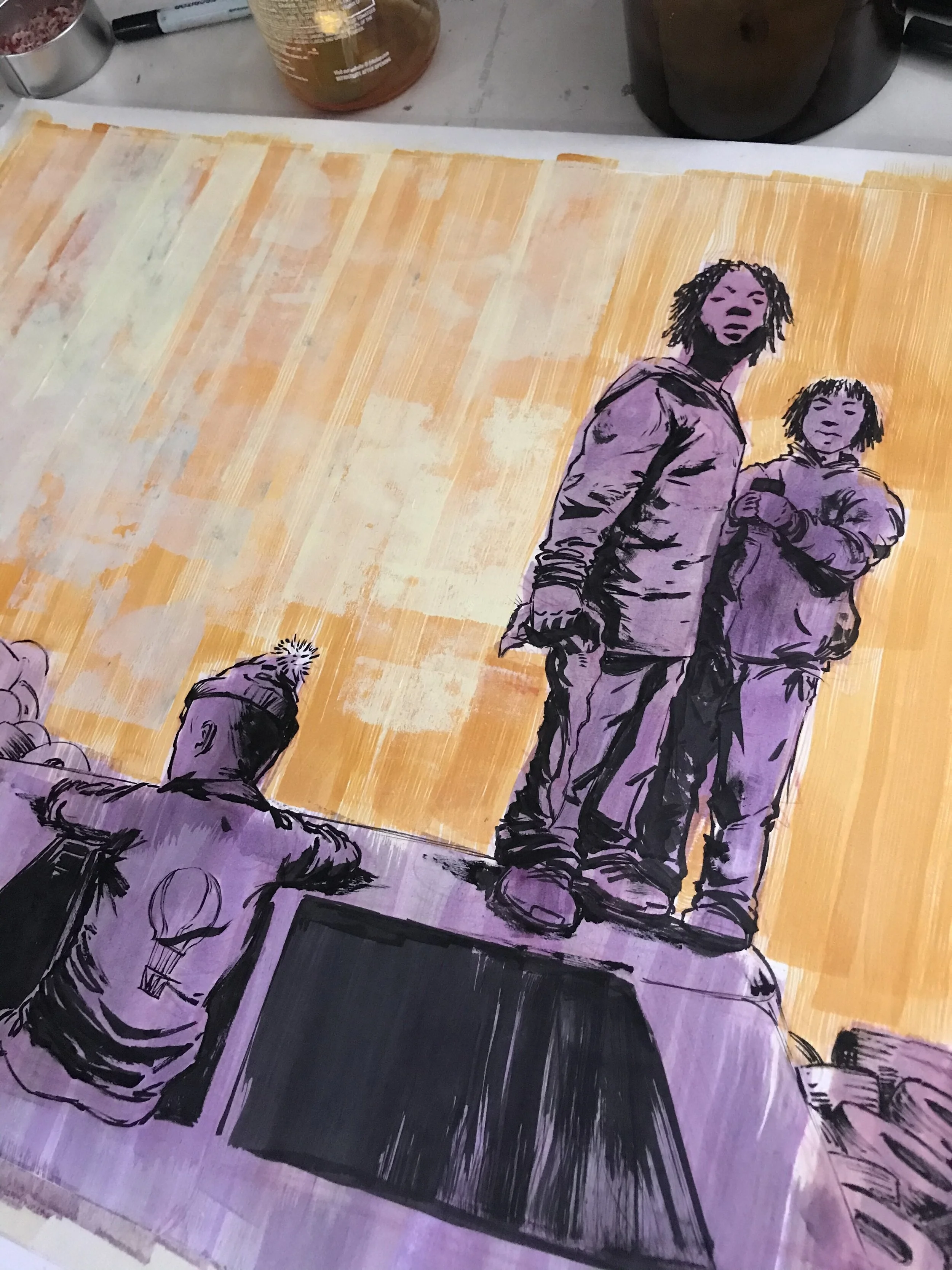
"The Boys" Process
Sketches & Layout
So for this illustration, I used a photo that I found on Pinterest. The photo was taken by Eli Reed, and what drew me to it was the way the kids were with the car. It gave me memories of playing with my friends in the backyard. My best friends’ brother was a mechanic. He’d keep cars in the backyard all the time! In between basketball games, me and the homies would jump in the 1970 Monte Carlo and pretend we were grown, driving wherever our imaginations take kids at that young age. I’m pretty sure we tried cigarettes in that car, and snuck beer lol. We weren’t entirely innocent, but no kid is… 😂
I normally have my thumbnails way tighter than this, but I was super anxious to get into the drawing with it being a jam piece. I was ready to make my mistakes on the actual image, and work around them.
Drawing on Illustration Board
This is much larger than I normally work ( the actual image is 16x20). I worked on a full size of illustration board, and just crop out the image in the corner. I use the rest of the board for mark testing and some “On the fly” color mixing. I drew straight on the board with a Carmine red Prismacolor pencil. I keep the drawing really loose, making sure i just get the proportions right, and save the texture elements for the ink work.
Illustration Board is cool, I can beat it up and throw all types of whatever nonsense, wet media I have at my disposal. One thing I like to do is use both water soluble, and water resistant ink. The combination allows me to put water on areas where the ink can run and give this cool “bleeding line” effect. Unfortunately, the board absorbed the ink alot, and as I wasn’t really sure where I was going with the piece, and just left that technique in my tool bag….this time.
I keep it super light when working this way, I know I’m gonna make most of my decisions with the brush and the ink. I’ll live and die with whatever decisions I make in the moment. I use the Windsor Newton series 7 no. 3, with Rapidograph ink, and a combination of brush pens, and flat calligraphy nibs. Trying to keep the lines varied, I rely heavily on dry brush to pump in some texture. I probably have my most fun at this stage of the piece.
I add some ink washes for my underpainting, and apply it with a foam brush in long vertical strokes. It gives it a dry, printed feel to the piece, I can’t tell you what in my history drew me to choose this method of applying color, but its stuck on me now, and I cant quite shake it. Not sure if I even want to.
Adding Texture with the Brayer
I like the Brayer. I do, I really REALLY do! Sometimes it feels like a gimmick but I absolutely don’t care! I used my dried up paint on my pallet, and mix my fluid acrylic colors right on top of it, to make it extra bumpy, and then get to laying it down. In vertical strokes, because that’s the rule.
Scanning and Digital Finishing
Scanning a piece in and working digitally over traditional piece is something I don’t EVER do. I know some people that do, but I’ve either been too lazy, or I reach a point with an Illustration that I’m happy with it and feel no need to pursue it further. That wasn’t the case this time. I wanted to see what else I could do. I think I actually fell in love with the potential of working over a traditional piece digitally with this little experiment. One thing that helped is that I organized my photoshop brushes. Not having to look for what brush I might want to use, made it a little easier. Scanning is still tedious, but I’ve gotten a lot better at it since the last time I done it, and I think that also helped.


